Richard Nixon was once quoted as saying, “If I go to the hospital, I’m fairly sure I won’t come out of it alive.”
It turns out the former President of the United States was not alone in his fear of hospitals.
70.3% of hospital patients report high levels of anxiety before an operation. In fact, so many people are afraid of hospitals that the American Psychiatric Association has given the fear a scientific name: Nosocomephobia.
Anxiety over the unknown is the biggest reason why people put off hospital or doctor visits, and studies show that people spend a lot of time researching their health problems online before even consulting a doctor. 1/20 Google searches are health-related, and 83% of patients visit a health care website before booking a medical appointment.
Health care providers are well aware of the stigma associated with doctor’s offices and hospitals, so they strive to create ads that lessen patient anxiety and assure they’re in good hands. However, many health care ads often miss the mark because they put too much focus on the hospital’s features, rather than the patient experience.
The most successful health care ads use empathetic messaging, as well as images of personalized care, person-to-person interaction, and patient healing. Ads that emphasize the human experience are more effective in reducing patient anxiety, increasing trust of the health care provider, and evoking positive emotions from viewers, which is critical, as positive emotions are a significant factor in driving purchasing decisions and increasing trust.
We decided to put two successful hospital ads to the test in order to better understand how patient-centric storylines and positive emotions helped the ads to strongly resonate with viewers. We chose ads that were produced for the same hospital and feature a similar storyline of a patient who was treated at the hospital.
To test the videos, we uploaded them onto Dumbstruck’s video testing platform which uses facial recognition technology and machine learning to track viewers’ emotions for every moment of a video, allowing users to see whether the video is evoking the response they want most from viewers.
The Research
We selected 200 people from our participant panel to watch each video. The participants were both male and female, ages 15 and older, with various ethnic backgrounds and located across the United States. All of our participants watched the video on their personal computers and reactions were captured via webcam.
The emotional data automatically displayed in a graph on the Dumbstruck platform, which measures six core emotions - Joy, Surprise, Anger, Fear, Sadness, Disgust - along with attentiveness, eye movements, and overall Mood of the viewers.
For this test, we focused on Mood as an indicator of emotional involvement and viewer enjoyment. The overall positive or negative trend of the Mood line on the graph is used to identify emotional engagement, cognitive engagement, and viewer retention. The Mood line displays positivity (above the baseline) and negativity (below the baseline).
After watching the video, participants were required to answer three follow-up questions:
1. “What was this video about?”
2. “Describe how this video made you feel.”
3. “What did you like most about the video?”
Results: Video A

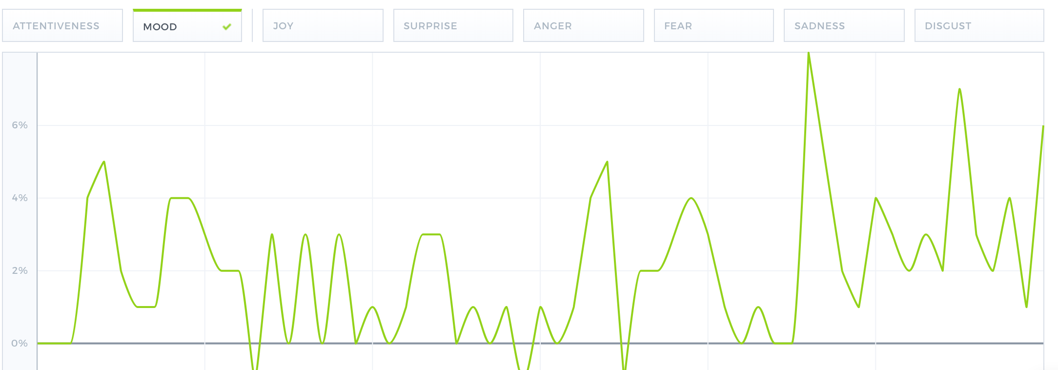
(Graph above displays the Mood line for Video A)
Video A opens on an older man talking about how he was devastated to find out he needed open heart surgery. The Mood line stays consistently above the baseline as the man tells his story, indicating a high level of interest. The Mood line then starts to rise as images of people being cared for are displayed on the screen, and peaks when there is a close up of the man saying: “When I first woke up after the heart surgery, it was the greatest feeling in the world.” The exterior of the hospital building appears next, along with the logo, and the Mood line continues to be high for the remainder of the video.
As depicted by the consistently rising Mood line, participants reacted very positively to this video. The fact that it ended with higher positive emotions than it began with is a strong indicator that the content was effective, and made a positive impact on viewers. This trend most likely occurred because of what we call the “fear and relief” technique, which is when an ad begins with a scary, anxious, or stressful situation and ends by showing how the brand’s product or services relieved that anxiety. In this ad, the man’s anxiety was relieved after his successful heart surgery at the hospital. Studies show that ads that begin by evoking fear or anxiety, and end by relieving that anxiety are effective in driving brand attachment and purchase intent.
Another factor contributing to the positive emotions of viewers is the personalized feel of the video. The ad focuses solely on the patient experience, and features various close ups of the patient as well as multiple images of human interaction. Whenever these kinds of images displayed on the screen, Mood levels spiked, and the highest rise in Mood came when the man talked about how great he felt waking up after surgery. The spikes in Mood at these particular times clearly indicate that viewers positively connected with the personal, “human” moments in the video.
The survey responses further show viewers’ positive reactions to the video. Participants commented that the video was “relatable,” “touching,” “re-assuring,” “inspiring,” and “human.” Many liked that the man in the video seemed like a real person, and some stated that they felt “happy” and “relieved” when the man revealed he had successful heart surgery. Other participants felt that the video did a good job of showing the hospital’s medical team helping people. One viewer stated that if they had a health problem, they felt they “could get through it” with “[the hospital’s] good medical team.”
Results: Video B

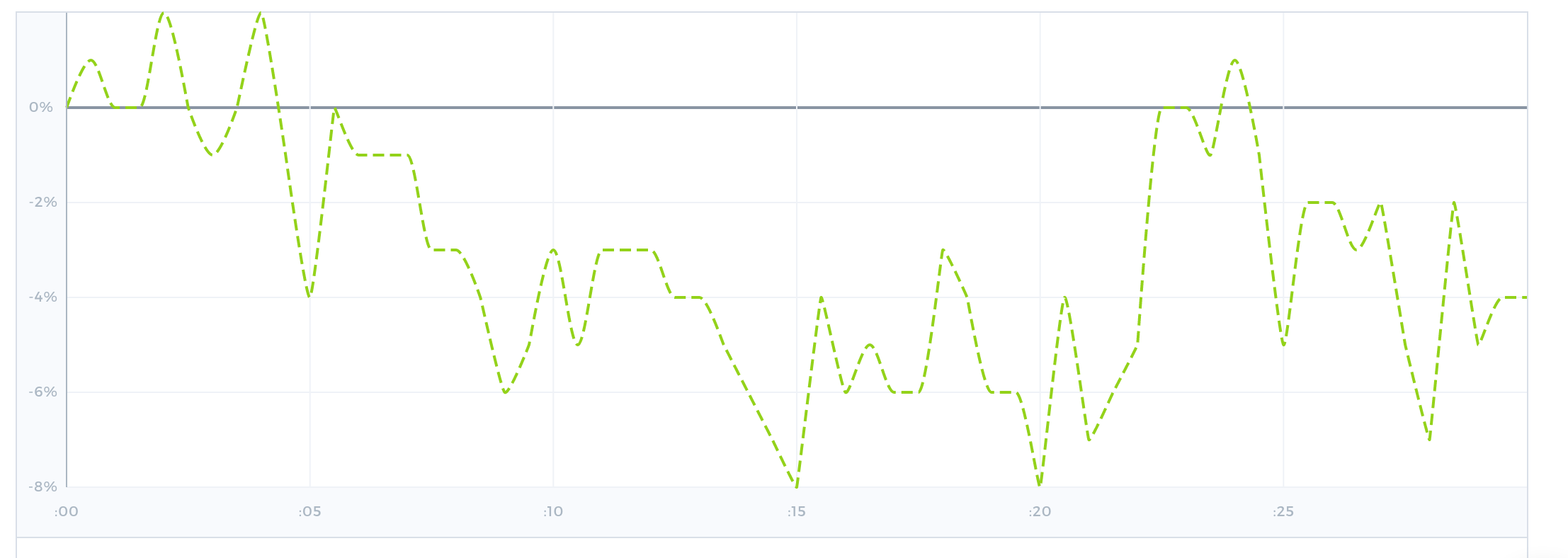
(Graph above displays the Mood line for Video B)
Video B opens on a woman describing how she had suffered from severe hand and back pain prior to visiting the hospitals’ orthopedic and spine care center. The Mood level starts off low, and then falls below the baseline as the woman describes her ailments. Eventually the Mood level starts to rise as she discusses the care she received at the hospital, and especially when images of human interaction are displayed on the screen. For example, the Mood level spikes when images of her being cared for by the medical staff appear and when images of the woman with her grandchildren are displayed. Following these images, the overall Mood remains higher for the remainder of the video, indicating an increase in positive emotions.
Like Video A, Video B uses the “fear-and-relief” technique by featuring a woman whose story begins with pain and anxiety, and ends with happiness and relief following her treatment at the hospital. Once again, the data indicates that this technique was effective as the Mood level started off low, then increased throughout the video, and remained elevated until the end. The increase in positive emotions indicates that the ad made a positive impact on viewers, and positivity is a significant factor in driving brand likability and purchase intent.
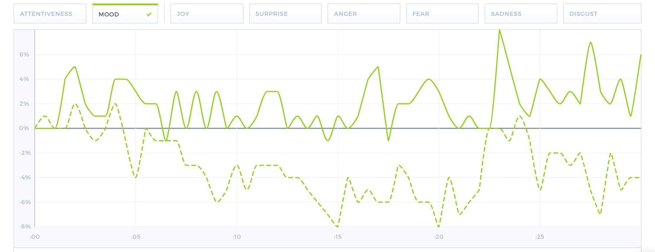
Overall, the Mood level for Video B was not as consistently high as Video A. This is mostly likely due to the fact that the beginning of the ad had too many scene transitions, which can cause viewer confusion, and detract from positive emotional attachment. Additionally, there were no images of human interaction until midway through the video. Only when images of person-to-person contact appear on the screen does the Mood level rise. Despite Video B’s lower Mood levels, the successful use of the “fear-and-relief” technique - indicated by the overall increase in positive emotions - kept viewers engaged and emotionally connected, thus strengthening ad effectiveness.
Viewers’ positive response to Video B is further shown in the survey answers. Many viewers connected with the personalized and relatable feel of the video. For example, one participant said, “I liked that it featured a real person, someone who I might know, someone who I can identify with.” Another stated that the woman in the video didn’t seem like an actor, rather she seemed like a “real, everyday [person] who suffers from chronic issues like I do.”
Other viewers commented that the video was “heart warming,” “personal,” and “touching.” Many participants also commented that they liked how the woman found “happiness” and “relief” from her pain by the end of the video.
What Both Videos Did Right

(Graph above displays the Mood line for Videos A & B. Video A is the solid line, and Video B is the dotted line)


